
brand identity
Logo Branding Design
Alexander Tailoring
Paw Pet Care
Nextgenz Dance Studio
Hawthorn Fish & Chips
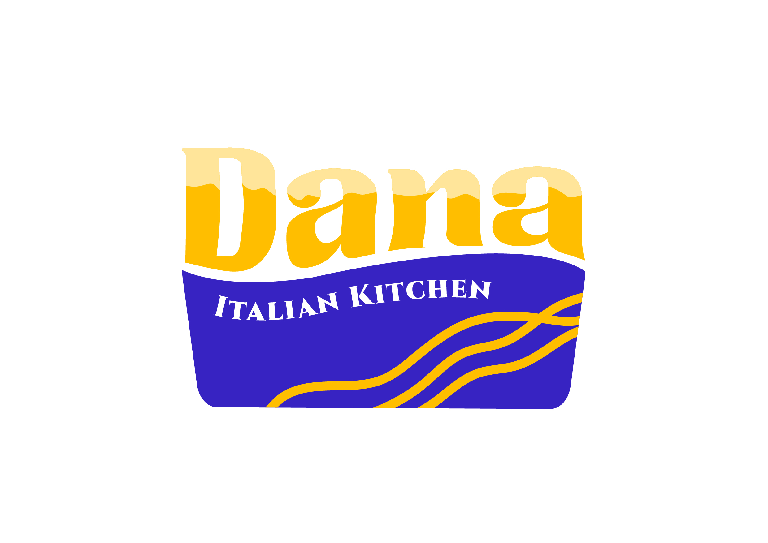
Dana Italian Kitchen

New Heights Consulting Architects

Eco Renew Kinetic Energy

S & A Charted Accountants
Ava Medical
new heights consulting architects Brand identity
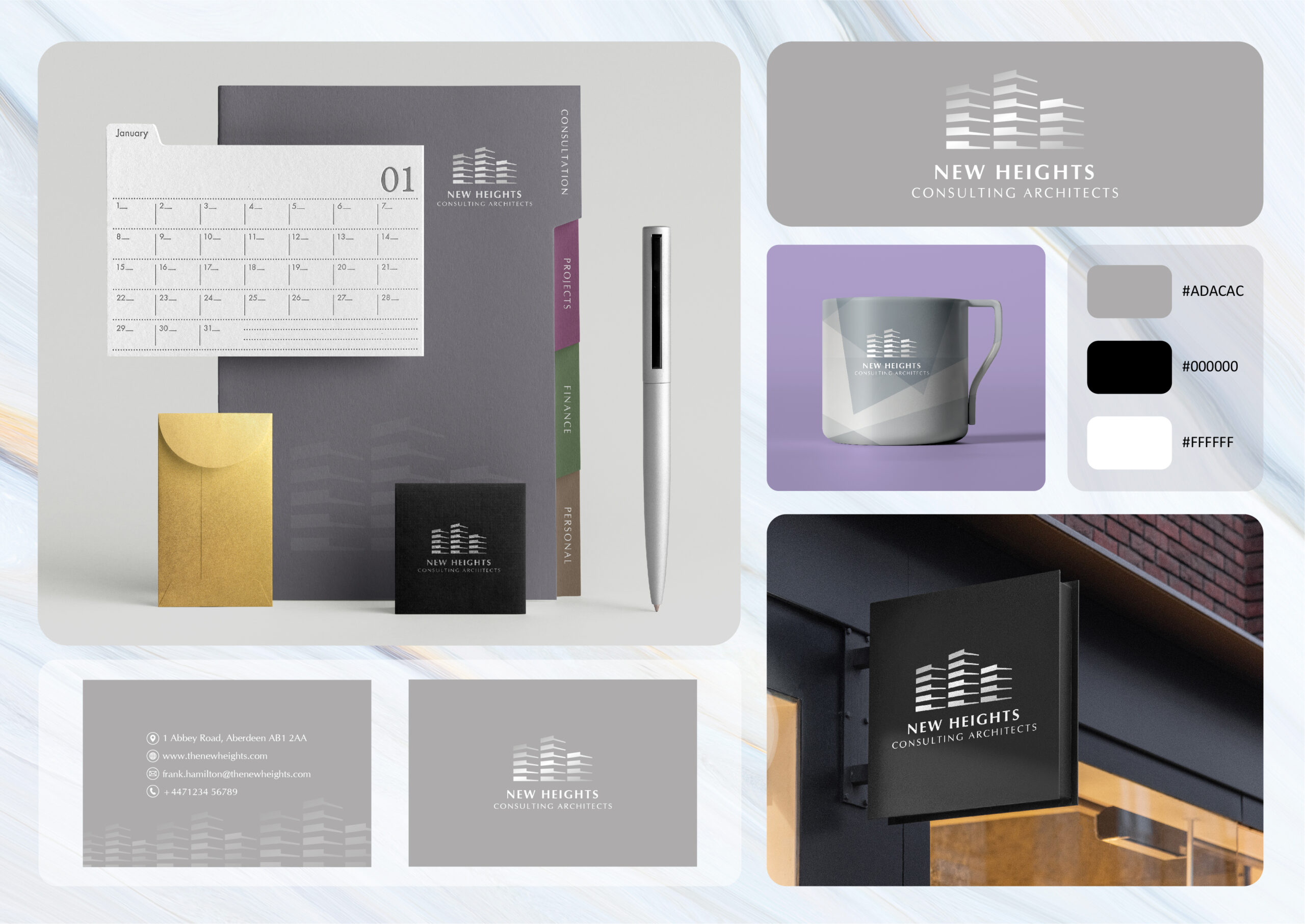
Design Brief & Project Overview: New Heights Consulting Architects Branding The objective is to create a cohesive branding suite for New Heights Consulting Architects, featuring stationery, promotional materials, and signage. The design should reflect professionalism and modernity, suitable for an architectural consulting firm. Key Design Elements: clean, minimalist logo with a building icon to represent architectural expertise. A monochromatic colour palette of grey, black, and white to convey sophistication. Branding across various touch points, including business cards, mugs, folders, and signage. A unified visual identity that enhances brand recognition, communicates professionalism, and resonates with clients in the architectural industry.
dana italian kitchen Brand identity
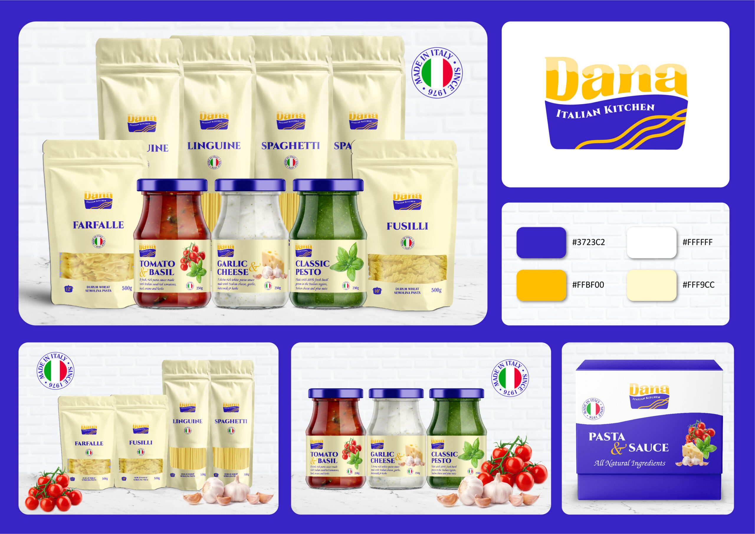
Design Brief & Project Overview: Dana Italian Kitchen – grounded in Italian heritage and renowned for using high-quality ingredients, aims to create visually appealing and cohesive packaging for its pasta and sauces. The design should reflect the brand’s Italian origins while conveying a sense of premium quality. It must differentiate between product types while maintaining consistency across the product line. Key aspects include featuring the “Made in Italy” seal, highlighting natural ingredients, and using a unified colour scheme of blue, yellow, and white for strong brand recognition. Clear, legible product information with easy-to-read typography is essential. The design should be adaptable to various packaging formats to ensure consistency across the range. The ultimate goal is to enhance product visibility and communicate Dana’s commitment to authentic, premium Italian quality.
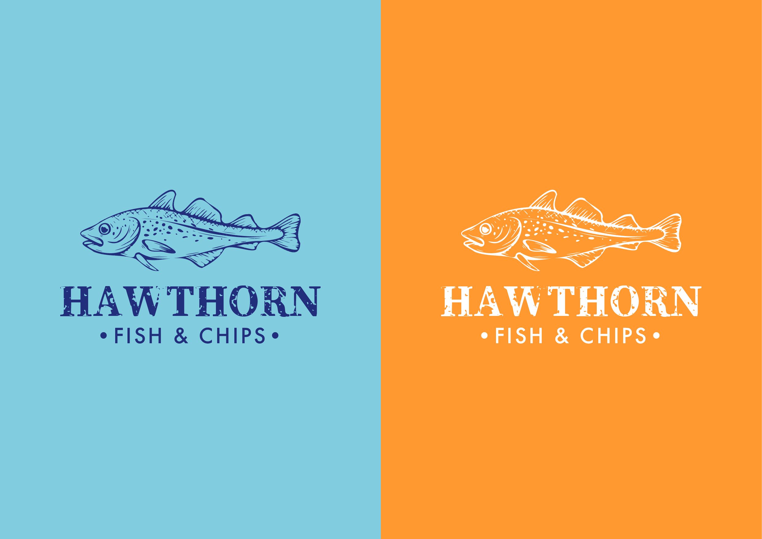
Hawthorn fish & chips Brand identity
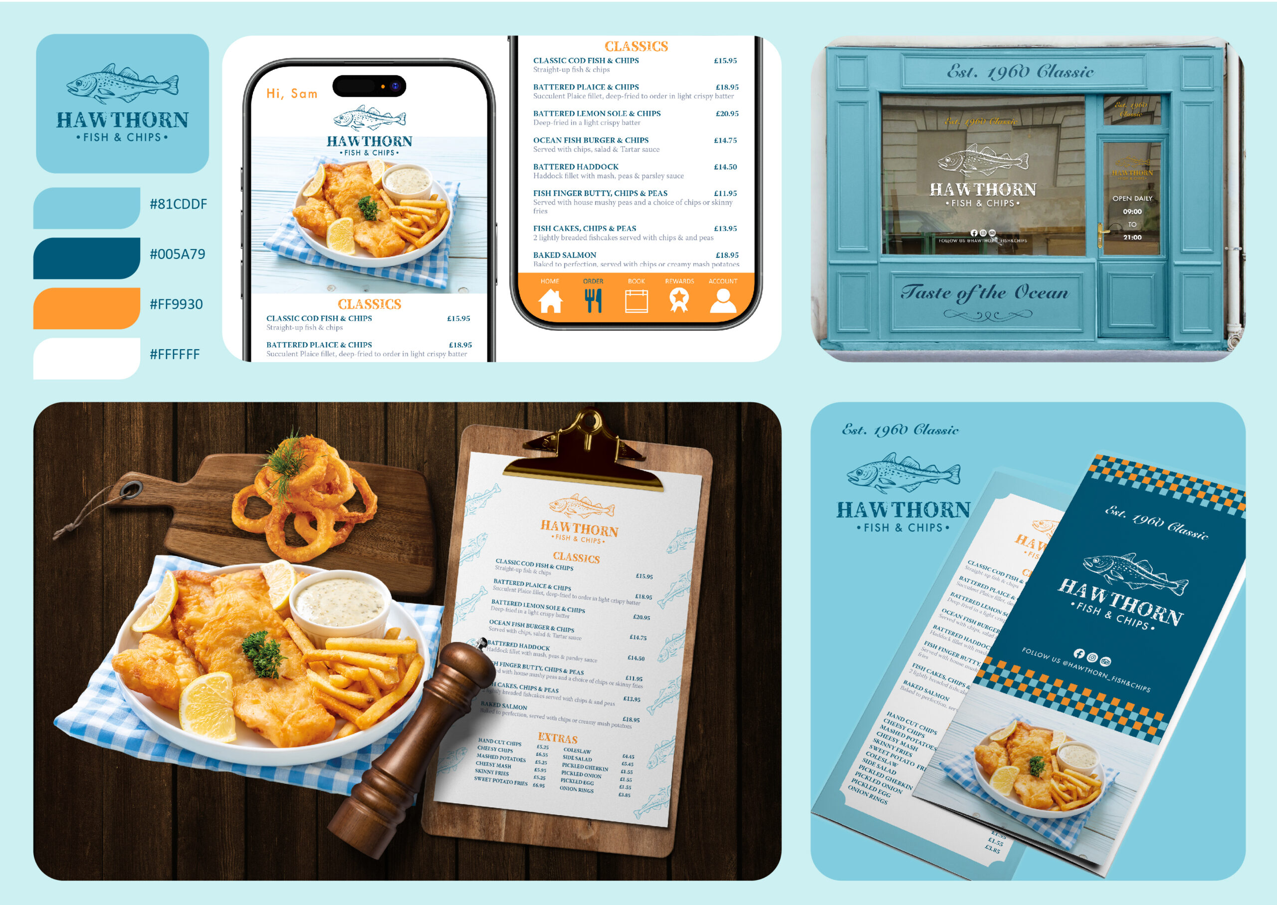
Design Brief & Project Overview: Hawthorn Fish & Chips aims to create a cohesive and inviting brand identity for a classic fish and chip shop, emphasising its long-established history since 1969. The design features a vintage-inspired aesthetic with a modern twist, incorporating a soft blue and orange colour palette. The visual elements include a storefront design, menus, digital interfaces, and promotional materials, all unified by the iconic fish logo. The imagery highlights fresh seafood and the traditional fish and chips dish, ensuring brand consistency across print and digital platforms for an authentic, welcoming experience.
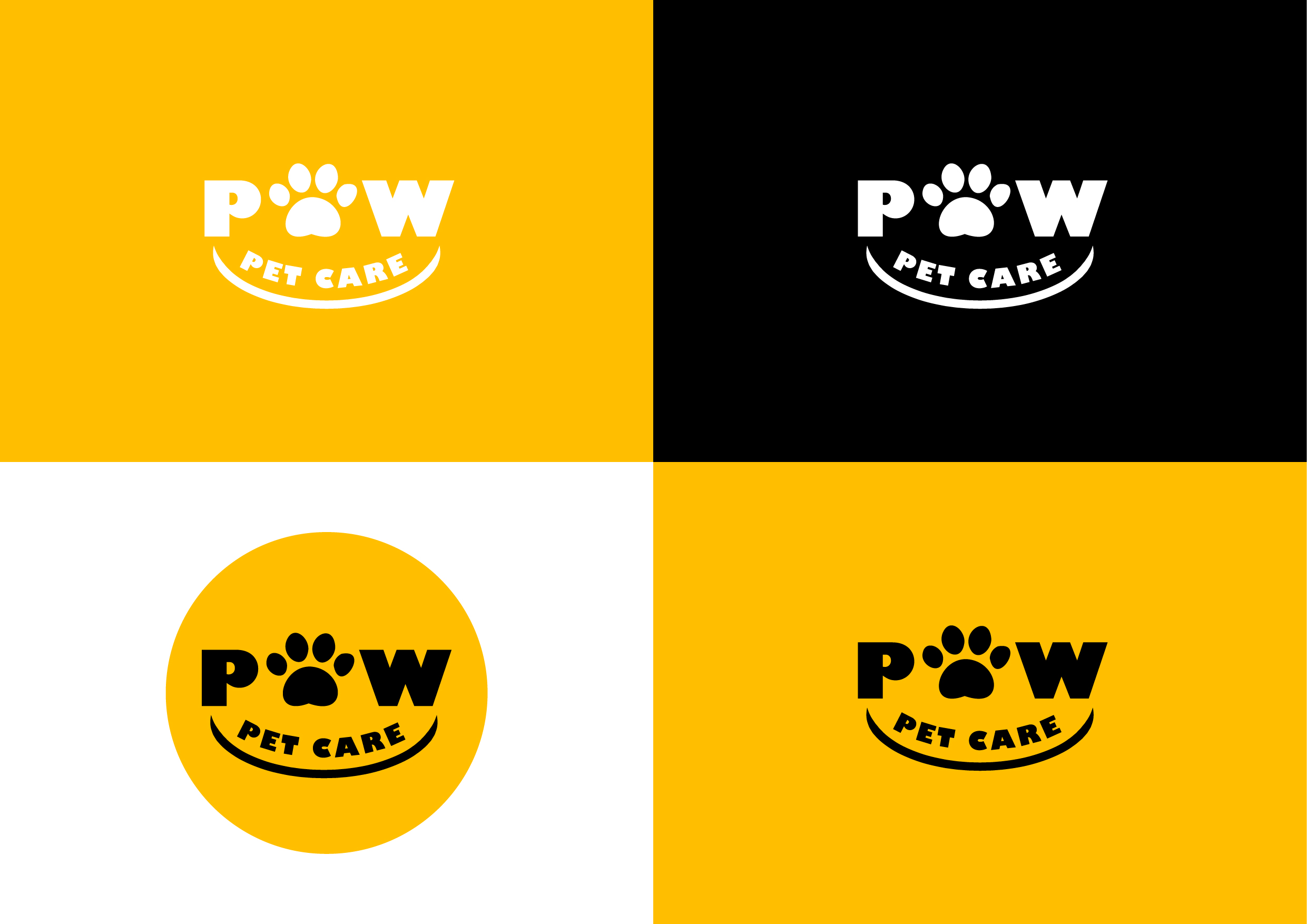
Paw Pet Care Brand identity
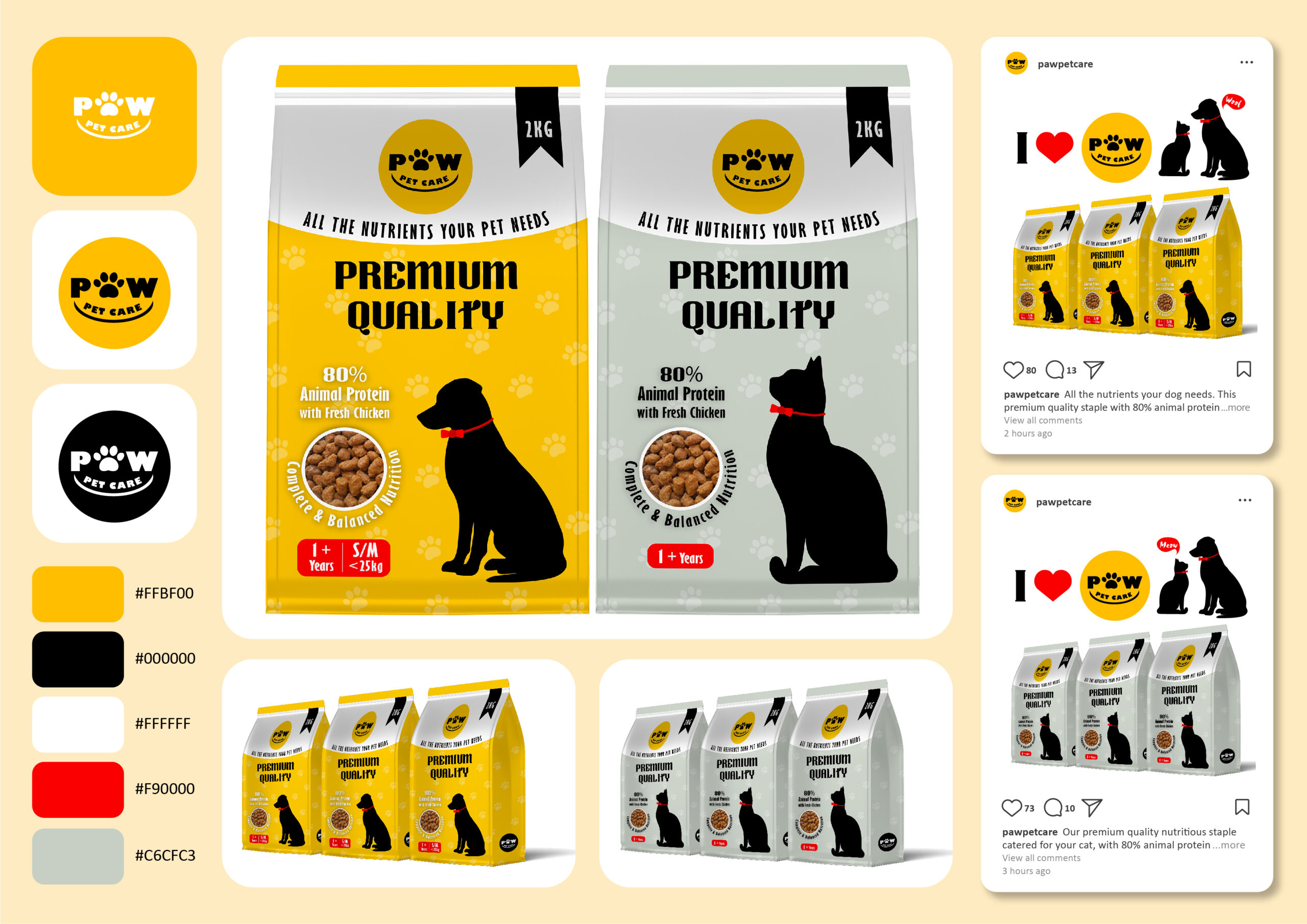
Design Brief & Project Overview: Paw Pet Care is a premium pet food brand catering to both dogs and cats. The brand emphasises high-quality, nutritious food, containing 80% animal protein, predominantly fresh chicken, to ensure pets get all the essential nutrients they need. The brand’s focus is to communicate the premium nature of the product while evoking a sense of trust and care for pet owners who seek only the best for their pets. The objective is to develop a brand Identity that conveys trust, quality, and love for pets. The identity should resonate with pet owners who value the health and well-being of their pets and prefer a premium product. Create a Visual Language that appeals to both dog and cat owners, unifying the brand’s offerings under a single aesthetic that feels approachable, professional, and premium.
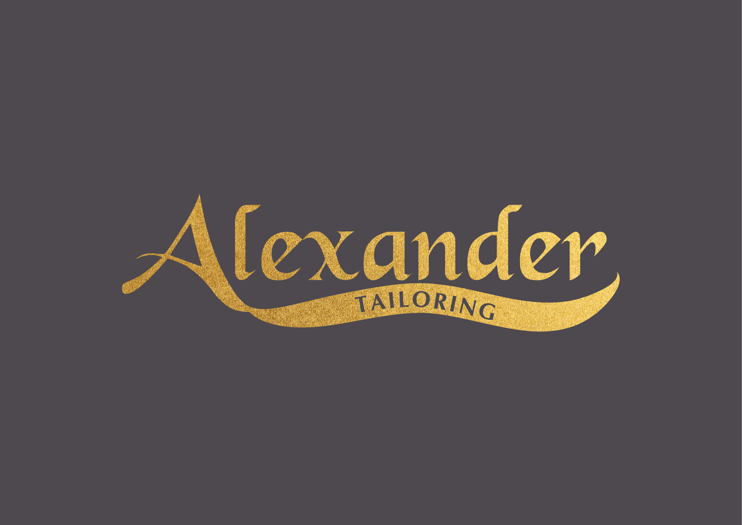
Alexander tailoring Brand identity

Design Brief & Project Overview: Alexander Tailoring Branding is a refined, cohesive visual identity that appeals to discerning customers seeking luxury, bespoke tailoring services. The objective is a luxury branding strategy for Alexander Tailoring, encompassing store signage, labels, packaging, and website design to reflect the brand’s bespoke tailoring expertise while maintaining a high-end, elegant aesthetic. Key Design Elements: sophisticated logo with a foil stamping option for premium appeal. Dark colour palette paired with gold accents to communicate exclusivity. Branding applied across physical elements (storefront, shopping bags, labels) and digital platforms (website).
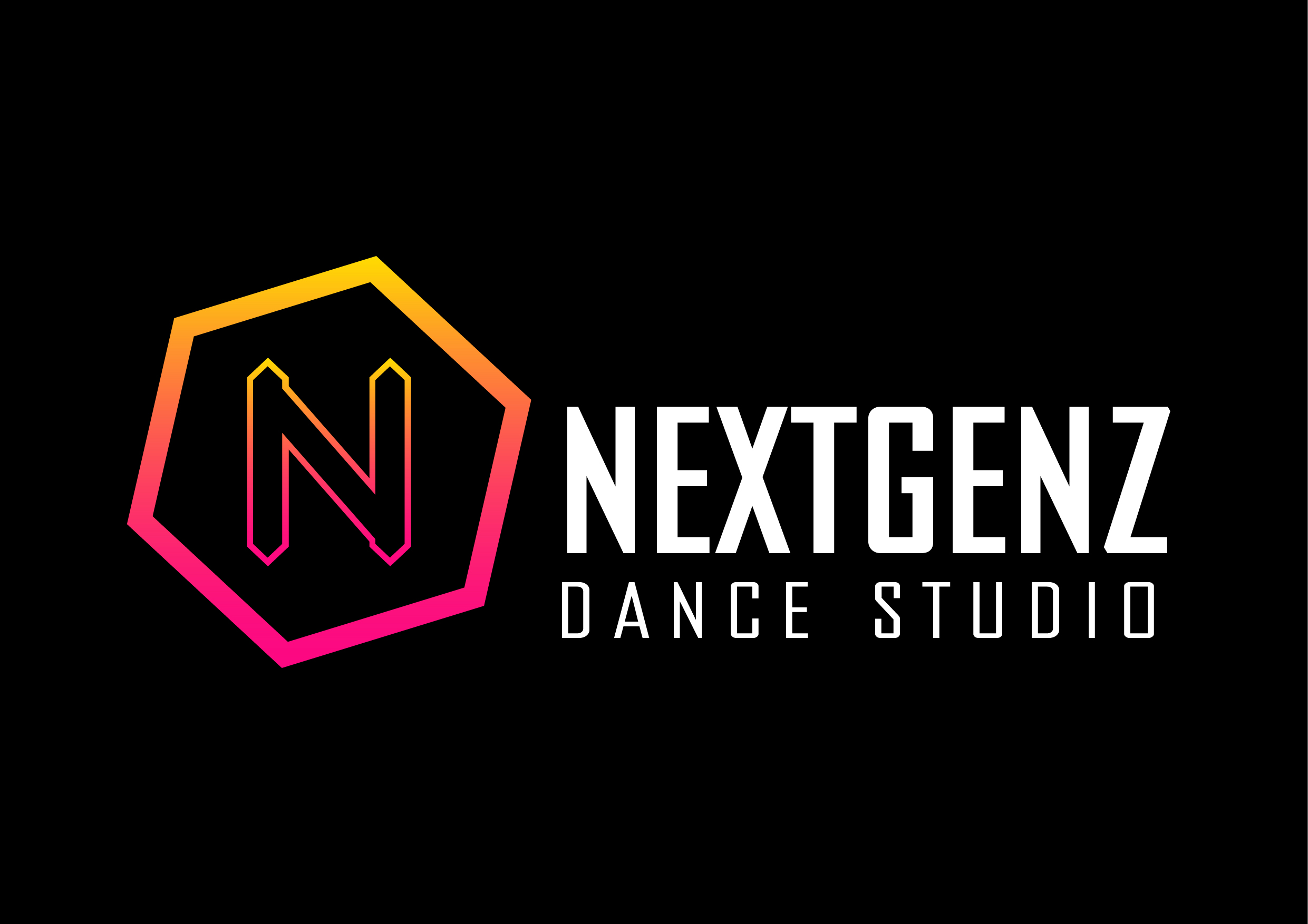
nextgenz dance studio Brand identity
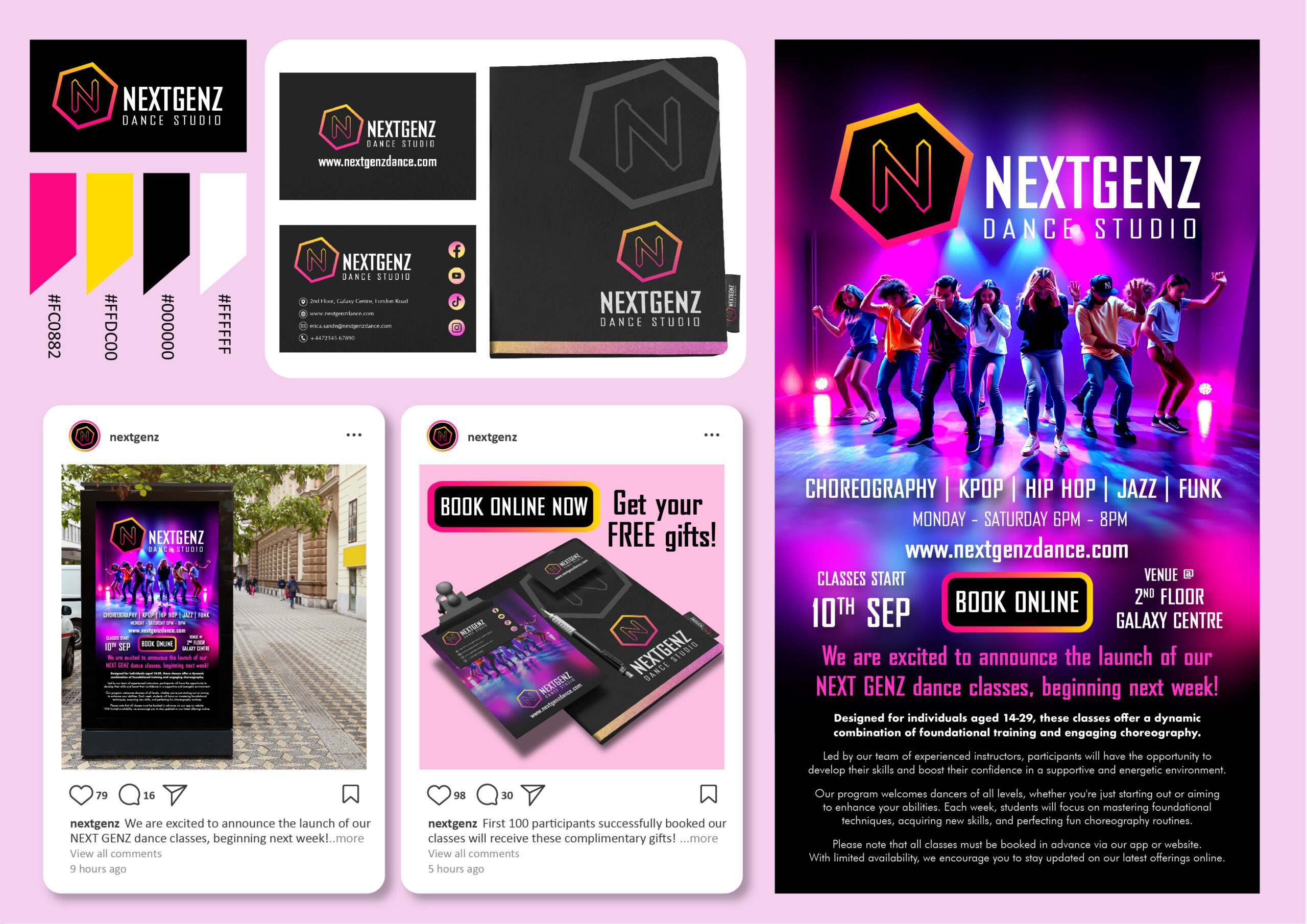
Design Brief & Project Overview: The NEXTGENZ Dance Studio branding project aims to establish a vibrant and energetic visual identity for a contemporary dance school. The design features promotional materials such as posters, business cards, social media posts, and digital flyers. The focus is on dynamic imagery that highlights various dance styles, including K-pop, hip hop, jazz, and funk, to attract young adults aged 14-29. The bold typography, modern logo, and vivid dance scenes convey a sense of energy and movement, perfectly aligning with the studio’s mission to inspire confidence and creativity through engaging, high-energy dance classes.
eco renew kinetic energy Brand identity
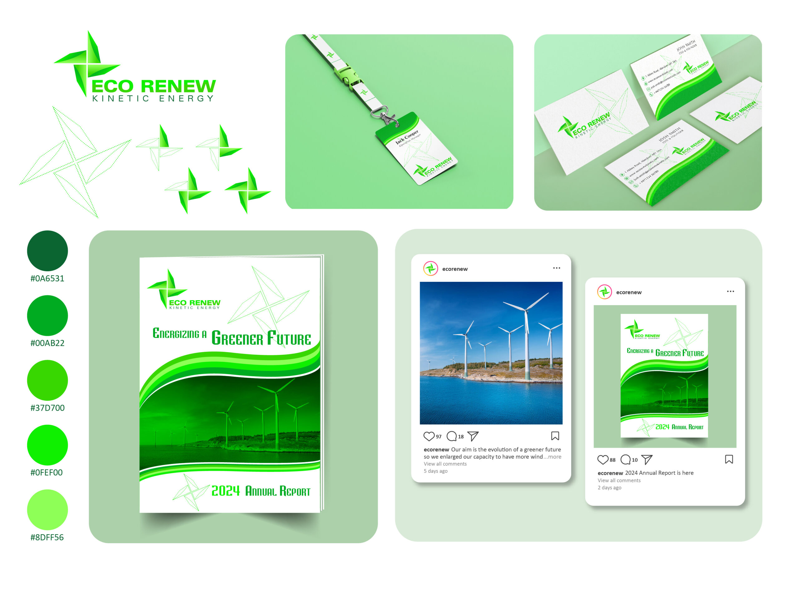
Design Brief & Project Overview: The Eco Renew branding project is designed to reflect the company’s commitment to sustainable energy solutions, specifically focusing on kinetic energy and renewable resources. The brand identity is centred around a fresh and eco-friendly image, using a windmill-inspired logo to symbolise clean energy. The promotional materials, including business cards, lanyards, annual reports, and social media posts, all showcase an eco-conscious aesthetic. The design elements emphasise green tones and clean, minimalist layouts, reinforcing the message of environmental responsibility. To communicate the company’s role in shaping a greener future through innovative energy solutions.

Let’s Connect!
Have any questions? I am always open to talk about your business, new projects, creative opportunities.